Tony Lemony: combination of joy and minimalism
DS1 Branding agency developed the packaging for
“Tony Lemony” lemonades
Goal and ideas
«Heineken» reached out to DS1 branding to develop a new line of beverages. Special attention was paid to creating an effective and attractive packaging design.
Concept and naming
At the beginning of a concept developing for “Tony Lemony” DS1 Branding agency tested several naming and stylistic options to single out the most suitable of them. The team worked out the following ones: “Natural Soda”, “Natural Bubble” and “Soda-Boom”. Each name comes with the corresponding concept. For instance, for “Natural Soda”, DS1 Branding has come up with a colourful flowery design referring to the merge with nature. For “Natural Bubble” – the combination of craft and nature-inspired design. No specific stylistic features were used in the design for “Soda-Boom” packaging where Lemon-character was implemented.

Development and realization
As a result of presenting different concepts to the client, Lemon-character was chosen. It appeared to be the most attractive and catchy. However, the problem of balancing between being extraordinary and appealing to the youth at the same time was a significant one. Among various options DS1 Branding team has picked the name “Tony Lemony”, a wordplay which reflects brand character and the taste of this beverage.
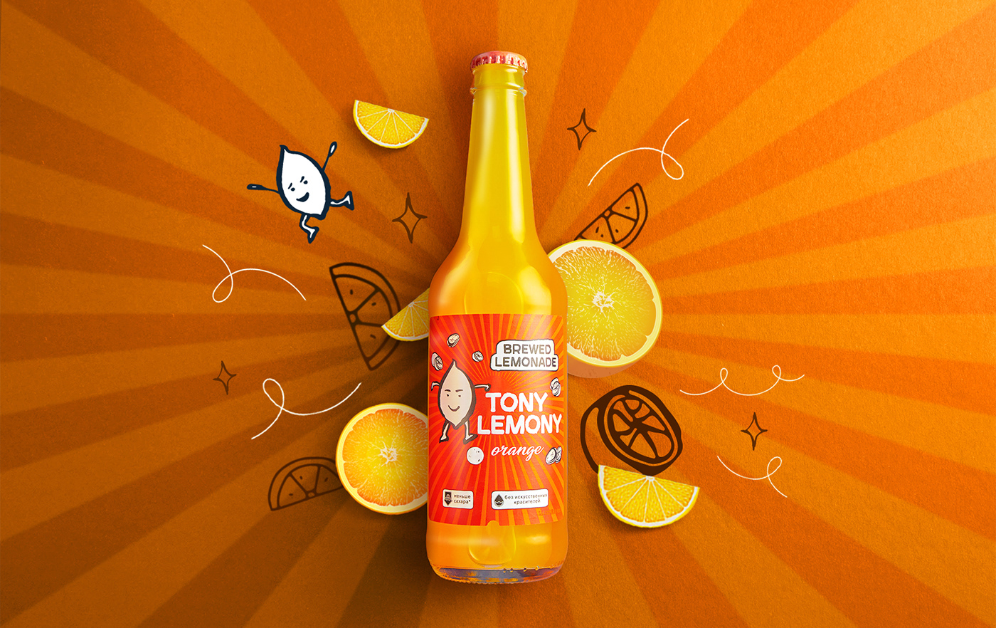
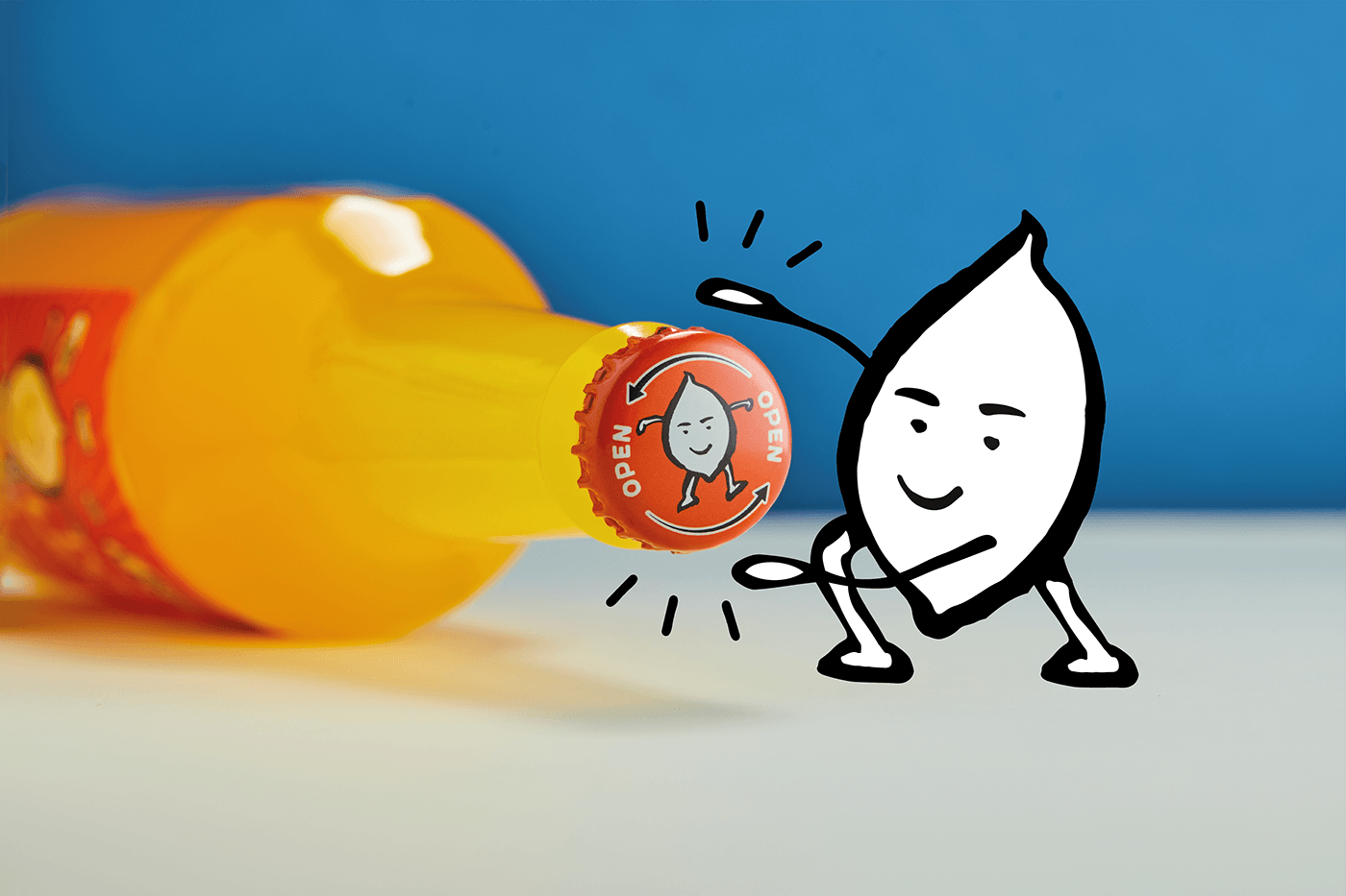
Tony Lemony`s key feature is his smiley look with a touch of masculinity indirectly inspired by Tony Montana. The idea of turning Tony Lemony into a gangster wearing a moustache and a hat was rejected according to the positive and child-friendly brand character. DS1 Branding team`s contribution to the design is implementing simple, minimalistic features and a stylistic approach unusual for Russian consumers.
Colour palettes and visual presentation
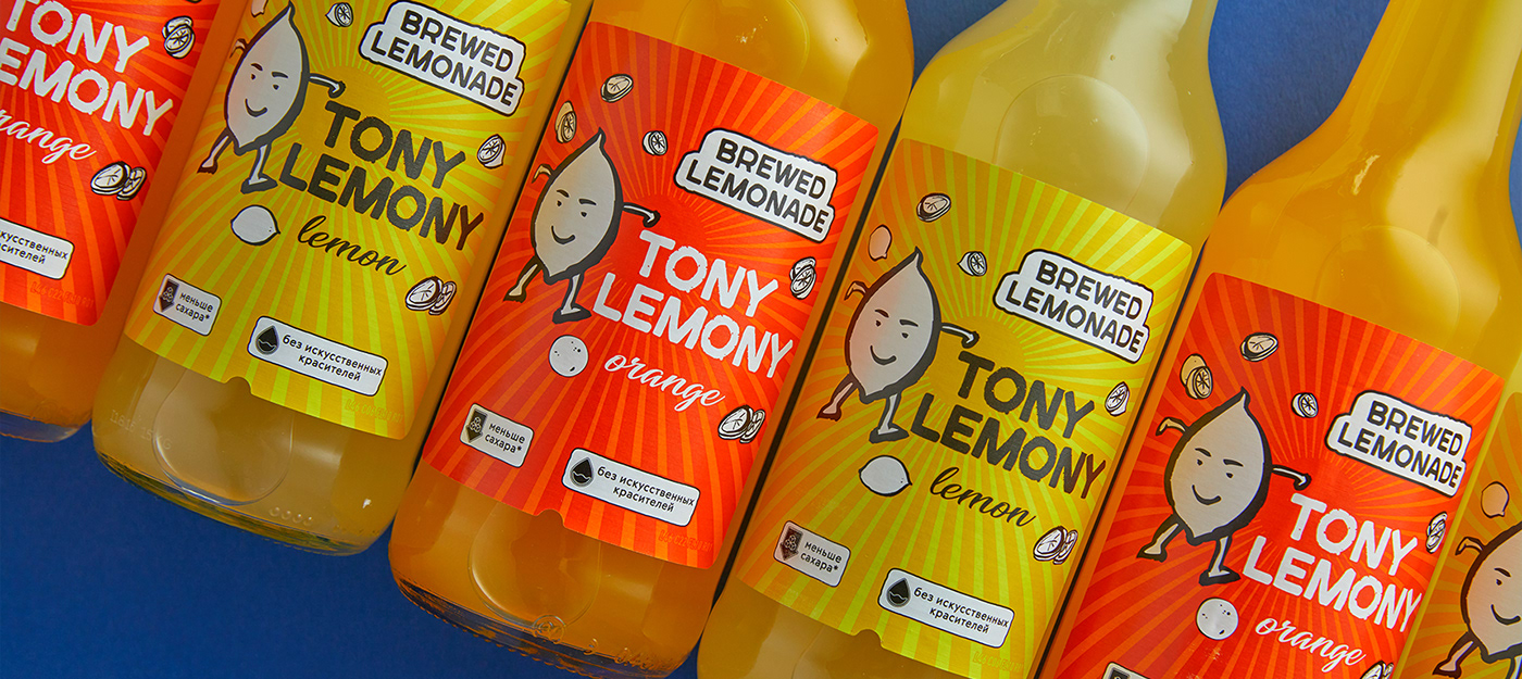
Various colour palettes were created for each taste of “Tony Lemony”. Two types of samples were used during the presentation of the packaging design: glass and PET plastic bottles. At this stage the team faced the problem because the bottle shape resembled a beer one. The shape was quickly changed to guarantee product`s unique design on store shelves.
The final packaging design of “Tony Lemony” reflects its taste and the nature of a brand – bright and eye-catching. This product line was launched in the run-up to summer to offer a refreshing sparkling seasonal drink.

Finished products and catchy look
The drinks are already presented on store shelves drawing attention to their unique packaging. They are catchy, visually-appealing and easily recognized due to the link between the key design element and the brand name itself.
Daria Zhadinskaya, brand manager of sparkling beverages
"Our consumers pointed out that the packaging of “Tony Lemony” lemonades stood out among the others. “Funny”, “attractive”, “cool and catchy mascot” – this is the feedback we received. The product is considered a part of a premium and high-quality market segment. At the beginning of our cooperation we wanted the agency to avoid creating a “childish” image of our drink and the final result totally met our expectations. We are completely satisfied with the outcome of our partnership with DS1”


